Friday, 11 April 2014

Media Evaluation power point


Media Evaluation

In what ways does your media product use, develop or challenge forms and conventions of real media products?
For my AS media coursework assignment I was tasked with producing a music magazine comprised of three media texts (front cover, contents page, double page spread). For my magazine I chose to cover the Hip-Hop genre. To cover the conventions used in hip-hop magazines, I researched the biggest magazines in the genre and developed the conventions used. This was done to give the media texts a professional look, and to appeal to the same audience as the media institutions I researched. Examples of conventions I developed include the use of similar fonts, a large masthead that conforms with the house style of the magazine, a large main image, the use of three font colours throughout the magazine to add to the house style, the use of a barcode, the use of social media links, and the use of only two fonts. My media product challenges conventions as well as developing them, as you can see, the Front cover doesn’t feature a plug, this is because I felt that after researching institutions within the genre, that many other media products within the genre would often not include plugs, and I feel that the lack of a plug conforms more to the other institutions within the genre, and the audience. For this reason I decided that the use of a plug would not be in keeping with the genres conventions, and that my magazine would look more professional as a result. Throughout my product I have stuck to the same text font, this is done to portray a professional image to the consumer, as using different fonts gives the impression of an amateur product, and a lesser quality when compared to other magazines within the genre that have a universal font, along with colour schemes and conventions this can help to give the media product a unique house style, which is important when trying to define the product from the rest of the genres media products. As this gives the user a sense that they are buying a quality brand, and will allow for a fan base to grow. The development of a house style, and the use of 3 colours, and a universal font also help distinguish the magazine from the rest of the media products within the genre.
 
How does  your media product represent particular social groups?
 
My media product represents younger people, and hip-hop fans through the covering of younger artists, and the images being comprised of younger artists. As well as the competitive price of £2 per copy, which is an affordable price for younger fans. In my the market research I performed before producing the final product, I found that the majority of Hip-Hop fans were of a younger age, and decided that the £2 price tag was more appealing to a younger audience, as well as the development of other institutions such as VIBE, which also market their product towards a younger audience.


Who would be the audience for your media product?
My target audience for the magazine is young hip-hop fans who are either working class or students. I targeted this particular audience because after researching the target audience of other media institutions within the genre, I found that they all targeted and appealed to a younger, urban audience. To help decide on a price for the magazine, and features that should be included, I conducted a videoed focus group and found out that younger audiences are interested in cheaper magazines, with features on festivals, gadgets, up and coming artists, album reviews and interviews with famous artists. This helped me set a price for the magazine, and choose topics to cover within the magazine. I also used the social economic study I performed to help decide on which audience the magazine would be marketed towards.
How did you attract/address your audience?
 

My magazine attracts the target audience through the use of competitive pricing and features on artists that the target audience are interested in, by not using a plug to attract the audience, the magazine can be sold for a more appealing price, which I feel is more likely to attract customers than the chance of a free gift bag or festival ticket. as well as the use of plugs and a low price, the magazine also feels professional, and because I developed the conventions used by other magazines in the genre, the magazine feels like part of the Hip-Hop scene.
I stereotyped the audience by focussing on certain features such as technology, interviews with artists, and festival news and information. These features tend to be more interesting to a young reader, than a reader in their 50’s, for that reason, the magazine represents people of a younger age, and in the socioeconomic groups of D and E.
What kind of media institution might distribute your media product and why?
 Media companies such as Spin Media would be the most likely institution to distribute my media product, this is due to the fact that their main media product (VIBE) is aimed at a similar market audience and covers similar genres of music (Hip-Hop and R&B). As well as this, as VIBE is a quarterly magazine, spin media may find that there is a gap in the market for a monthly magazine targeting young urban hip-hop fans, As well as DJ’s and people interested in audio equipment.
I would want an institution such as Spin Media to distribute my media product, due to the fact that VIBE is one of the biggest media products within the genre, and has a large circulation, I feel that being associated with this institution will help increase circulation, and portray a professional look for the magazine, as well as being able to reach out to a larger audience. As well as this, because spin media are already in the business of distributing magazines within the same genre, they will be more experienced in advertising the product and increasing circulation of the magazine, and therefore overall turnover.
What have you learnt about technologies from the process of constructing this product?
 
Throughout the year I have learned a multitude of different techniques in Photoshop, this includes the use of red eye reduction, crop tools, organising of layers, changing opacity of a layer, importing images, use of shape tools, use of magic wand and use of selection tools. I also used tools such as transform, which allowed me to change the size of an image, without changing the aspect ratio and distorting the image. Although I could already utilize some of these tools before starting the course, the course has taught me how to properly apply these tools, and to recognise when other institutions use these tools to help create a house style for their product.


Looking back at your preliminary task, what do you feel you have learnt in the progression from it to the full product?
 
 
Looking back at the preliminary task, I have learned a multitude of photo shopping tools and techniques, as well as a larger understanding of the conventions involved in magazines, this has helped me to produce a more professional product, that develops or challenges conventions used by media institutions such as NME or VIBE magazine. Because of this, it is possible to create a house style for the magazine, and address the target audience effectively. I have improved on my use of fonts and colours over the 
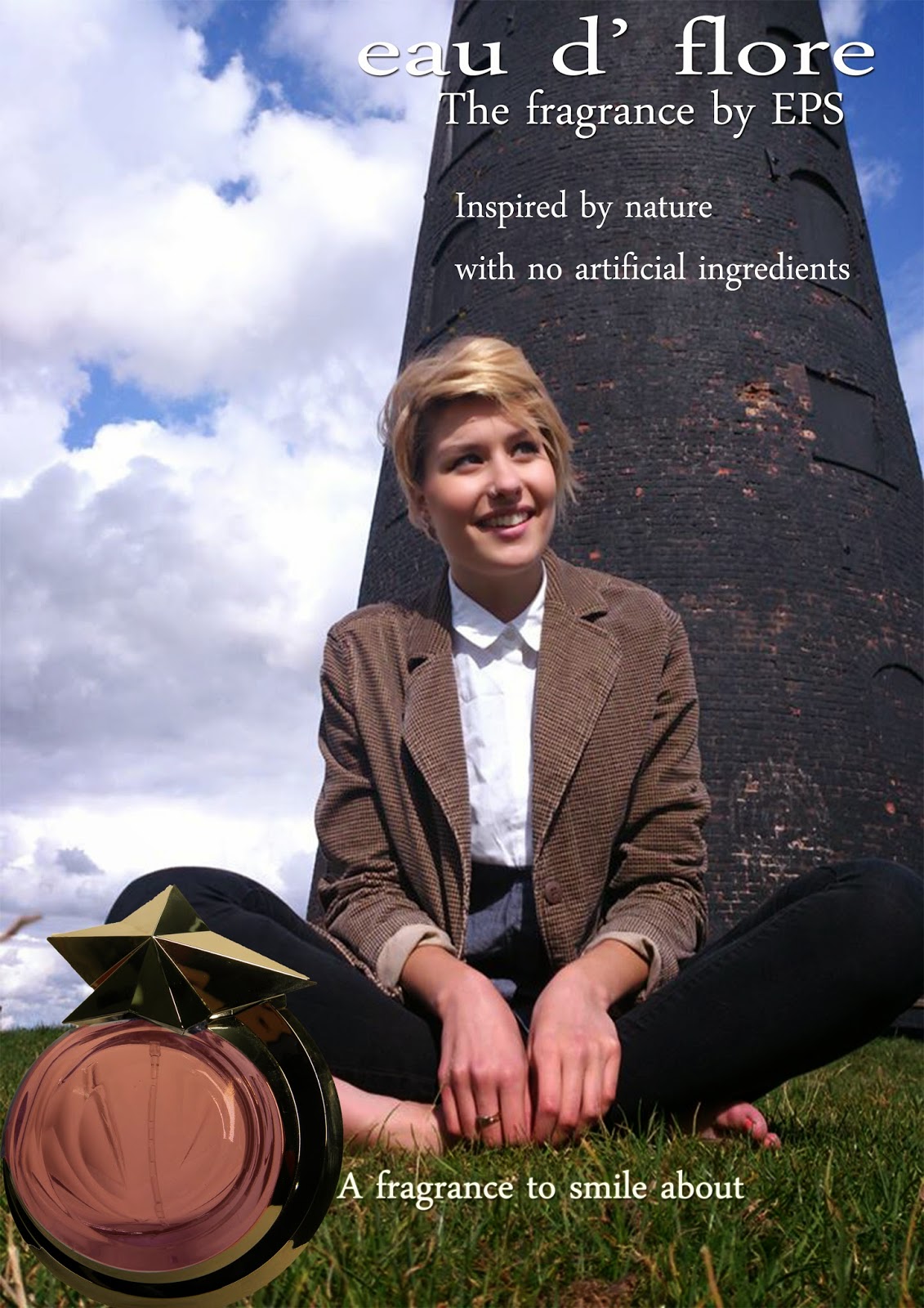
course of the year, the difference between my perfume advert and my front cover show how my use of fonts and colours has changed, as well as my understanding of the conventions in magazines
I believe the biggest improvement overall has been in the use of Fonts and layout, with my preliminary task and college magazine, I used standard photoshop fonts, rather than from dafont.com. This meant that the fonts used were rather plain. As well as that, the use of images on the media text has changed. Rather than using multiple images like I did in the first two tasks, I decided to have one main image rather than 2 or three images. This is because other institutions in the same genre don’t use multiple images on the front cover. This is an example of how I have learned to challenge or develop conventions I have learned from other institutions media texts.
If I had the chance to change the text I produced, I would take longer taking the main images, and would develop better feature stories, and would also implement the use of plugs and pull quotes more.
The preliminary task was useful because it allowed me to learn from the mistakes I made, and develop my skills to produce a higher quality media text. It has also allowed me to compare the two texts, and see how much I’ve improved, and in which areas.
I have learned a wide range of skills since the preliminary task, including use of colours and fonts and how they can help create a house style for the magazine. Photoshop editing such as spot healing and blur tools. Fast recognition of conventions within the genre and how they can be challenged or developed as well as being used to improve on my media text. These skills have helped me produce a media text that challenges or develops conventions within the genre, uses colours, fonts and images to create a house style for the magazine and is advertised towards a specific area of society.


Wednesday, 20 November 2013

Social Class Research


The social class I will be aiming the magazine at is E grade citizens(with my target audience being male students). I will cater towards their needs by using plugs that generic students are interested it, a cheap price, monthly instead of weekly iterations of my magazine, and features on money saving tips (good deals for headphones, speakers, or music). The magazine will also have advertisements aimed at students, such as cheap supermarkets (Iceland, heron, lidl, aldi etc.).

I believe a price of £2 is a reasonable price for students, and is not set too high that it will put students off of buying my magazine; the price is also set at a level that is still expected to deliver professional quality content. There will be subscription offers that have a better overall price that buying from the high street, as well as a 20% discount when bought with an NUS card.

The free gifts and plugs used would be “student survival packs” which include food supplies, some money (~£50) and alcoholic drinks. There would also be plugs including hi-fi systems, signed records/memorabilia from famous artists, as well as headphones as well.

Social class will help me choose which feature stories to use, instead of running feature stories on a £6000 pair of speakers, I will write feature stories about gigs, nightlife, and cheap deals on food/drink/tech that can be found. I believe these are things that students care about, as they would rather pay £2 to read about that than a product they will never be able to purchase. The social class will also help me in targeting the target audience, because the feature stories will be tailored toward students.


The image above shows a chart of social classes, the social class my magazine will be aiming for is class E or D citizens, or to be more precise, students. I will attract this demographic audience by using feature stories, double page spreads and plugs that are geared towards and will attract typical students, I will also set the price at an affordable and competitive level.

Thursday, 14 November 2013

Focus Group

 
The Focus group was useful because it allowed me to gain an insight into what the requirements of a magazine are for a group of students, who are the demographic I will be aiming the magazine at. It has allowed me to make decisions such as pricing, social media, feature stories and use of plugs.
I found the responses to the questions asked where pretty normal, I expected the price to be lower, but apart from that, I agree with what was said by the focus group. My General findings for the focus group are that the price should stay low, around £2.50-£3, social media is a useful tool to get closer to the readership community, there should be the option for digital copies of the magazine, available online to download, as well as the use of plugs to help draw readers in.
I will change my layout of contents pages to allow for social media links to be included, apart from that; I will add more features on music festivals and live performances, I have found that the majority of the information I received from my focus group helped confirm my previous ideas on the magazines layout, content and style.

Tuesday, 12 November 2013

Name and colour scheme

I have decided to call my magazine Ebonics, this is in reference to both the term for slang used by many African Americans, and connotations within Hip Hop itself, it is also giving reference to the song "Ebonics" by influential east coast Hip Hop artist Big L.

The colour scheme I have decided on is a mix of Black, Red and White. I have chosen this colour scheme after researching magazines within the genre and analysing their colour schemes, and conforming to the genres conventions in terms of colour scheme. These images show the front covers I viewed to help me decide. They make use of similar colours, and I hope to achieve a similar look with my magazine. I think the use of bold colours on the masthead for VIBE is particularly good, as well as the general use of fonts on the front covers.


Thursday, 7 November 2013

Mood Board


Mock up images

This is the original image I used for my magazine mock up, it features Roots Manuva and I used this image as it is suitable for a magazine front cover.


This is the finished image, I added text to the image, and removed the gray background from the image to keep with a set colour scheme, I used red text so that the text is easily readable and stands out to the reader.


This is an image of the original photo used, It features Method man and Red Man, and also displays a sterotype of Hip Hop fashion conventions.


this is the final image used, I used a red font to contrast from the black and white, and also because there was red writing on Method Mans T-Shirt, it also makes use of conventions such as a barcode, masthead and feature stories/images.


This is the original image I used for my Front cover with an MF DOOM main feature story, it makes a good use of colours and makes a good main image for a front cover.


This image shows the finished front cover image, I removed the gray colour from the background, and overlaid text over the main image, making use of the same colours, and a feature story and image on the top left hand side of the page, unlike some of the other front pages this doesn't have a barcode.

Saturday, 19 October 2013

Hip Hop Genre Research

For My AS Media coursework I will be basing my magazine on the Hip Hop genre.

 Hip Hop as a music genre has been around since the early seventies and first emerged as a movement in the south Bronx NY, Hip Hop has had increasing influences on popular culture, from movies and T.V shows, to fashion, as a genre, Hip-Hop can be described as a collection of samples, most often from funk, disco soul and jazz, with an emphasis on percussion elements, as well as rhythmic spoken word in the form of rapping/MCing.

Hip Hop gained worldwide recognition throughout the 1980's and led to a more commercial genre, and the creation of the first Hip Hop magazine. (The Hip Hop Hit List)

However, Hip Hop in the 80's was generally socially conscious, and focused on the social problems faced by the African American society in poor areas, as well as politics, racism and capitalism, artists who reflected upon troubles in society, as well as politics include Public Enemy, A Tribe Called Quest, De La Soul, Nas Gil Scott-Heron etc. In contrast, Hip Hop music from the 90's onwards has been mostly about gang violence, drug taking, misogyny, and weapons and is personified by artists such as Cypress Hill, Notorious B.I.G 2pac, Snoop Dogg, Dr Dre, N.W.A, Wu-Tang Clan and Mobb Deep among others. This sub-genre of Hip Hop is known as gangsta rap, and is arguably the most commercially successful aspect of Hip Hop. Hip Hop as a genre has continued to grow commercially and socially as an impact upon popular culture, and western society in general. Although criticisms have been made, of the newer forms that Hip Hop is taking, and its commercialism.

 Because of the wide variety of forms that are apparent in Hip Hop as a genre, there are an uncountable amount of artists that are defined as being Hip Hop artists, or have had significant influences in Hip Hop culture. (Gil Scott-Heron) However, the artists that are the most well regarded  musically include: Wu-Tang Clan (this includes the famous solo careers from RZA, GZA ODB, Raekwon the Chef, Gostface killah, U God, Inspectah Deck and Masta Killa) MF DOOM (this includes his collaboration with madlib) Madlib, Death Grips, Big L, Biggie Smalls, 2pac, Cypress Hill, N.W.A, Roots Manuva, nas, A Tribe Called Quest, The Jungle Brothers, De La Soul, Grandmaster Flash, Sugarhill gang, KRS-ONE, immortal technique, Public Enemy, Dr. Dre, Eazy-e, Snoop Dogg, Eminem and Busta Rhymes.

 Hip Hop charts are generally taken with a pinch of salt by Hip Hop fans, Artists such as Drake, Lil' Wayne, Jay-Z, T.I, Wiz Khalifa, Juicy J, Jeezy and Rich Homie Quan are currently in the US billboard Top 10, and the only bare any resemblence to the original genre in the top 10 are Eminem and Jay-Z.
 
Hip Hop as a music genre already has a plethora of music magazines that are focused on it, the most notable mentions are Hip Hop Connection, XXL, Scratch, The Source and Vibe.

Fashion in Hip Hop has changed over the years since its inception, early Hip Hop musicians would often wear colourful African clothes, because of the Genre’s Roots in west African and Jamaican music. Throughout the 1980’s the fashion for Hip Hop was baggy, comfortable clothes, often using bright colours, as well as clothes typically worn by break dancers, this is due to Hip Hops close relationship to Breakdancing as an art form. In the 1990’s the fashion leant more towards baggy shirts, T-shirts, Basketball shirts, expensive jewellery, Tims (Timberland boots) Pagers, sneakers, and tracksuits, towards the end of the 90’s fashion in Hip Hop also became more formal, with the use of suits and trousers, with black loafers.


This is the music video for Scenario by A Tribe Called Quest, it is a great example of pre-gangsta rap Hip Hop, it sticks to the conventions of early Hip Hop music videos, it is less about guns and explosions, and has a happier vibe to it, this is mainly because it was released in 1991 part of the D.A.I.S.Y age of Hip Hop.


This is a music video for the song Spread Eagle Cross The Block by Death Grips, it is a montage of people skating, and is a good example of how Hip Hop music links to skateboarding and breakdancing. The song also has lyrical themes revolving around capitalisation and the commercialism of Hip Hop.
 

Friday, 18 October 2013

Reasearch


·         Skyline with featured artists

·         Large masthead

·         Colour scheme (red, white, black

·         Featured articles on the left above barcode

·         Other features on bottom right of page

·         Lack of plug

·         Lack of pull quotes

·         Large main image

·         No images to accompany feature stories

·         Audience of magazine are hip hop fans and people wanting to read further into the culture and politics associated with the genre of music

·         Feature story titles are all red with white outlines

·         Same font used throughout

·         Mast Head is a phrase commonly used on hip-hop music

·         Smaller main image used, depicts the RZA as religious

·         Skyline features images, and is accompanied by a heading

·         Feature stories have white ‘rubbed out’ background affect

·         Features on both side of main image

·         Portrait barcode rather than landscape

·         List of other featured artist near barcode

·         Colour scheme of red, black and white

·         Masthead covers entire length of page


  ·         Large main image of Eminem, depicts hims as rebellious (tattoos, facial expression etc.)

 ·         Large skyline, with featured artists, and the question “Is 1998 Raps last classic year?”

·         Logo with “sticker effect” on top right of page, claiming that the issue is “the real rap issue”

·         Pull quotes used from main feature story

·         Features on both side of main image

·         Different parts of text emphasised by using different colours and font sizes

·         Colour scheme of red, black and white

·         No barcode featured on front page

·         Use of rhetorical questions on front page


Thursday, 17 October 2013

Evaluation

Evaluation


For the preliminary task assigned to us, we had to design a front cover for our own college magazine, throughout the previous weeks I have researched and studied the different forms and conventions of real magazines, and some other college magazines that achieved an A grade. I then wrote about conventions used in magazines, and made sure to include as many conventions as possible from the specified media texts (magazines), I developed the use of feature stories, and a barcode, as well as a Mast head and colour scheme. I developed these conventions to give the magazine front cover a professional appeal, and to make it appear real. I also used suitable fonts, and a large main image, to grab the audience’s attention.
My Media product represents a variety of social groups, the main social group catered for are the students currently enrolled at Wyke College, this is because the main image is that of a student rather than a teacher, and that the majority of feature stories cater to students, however, students aren’t the only social group given thought to. Other social groups advertised to are the parents of students, and teachers. Who may be interested in feature stories, involving a tour of the campus, grade results, success stories from Wyke College, and Q & A sessions with teachers. The most represented social group in my magazine are the students currently enrolled at wyke.

The target audience for my magazine are primarily students, although other social groups have stories they may be interested in, the majority of feature stories are targeted towards students, I attracted the student audience by using a student as the main image, and catering the majority of content towards them.
I have had to learn a wide variety of technological equipment and software since starting the assignment,  the biggest learning curve for me was learning to use and implement Photoshop effectively, I also used technology such as a scanner to scan examples of magazines that follow the same conventions, as well as using the internet to research the conventions of magazines, and collect research material of previous college magazines, to see the general do’s and don’ts of magazine front covers. I have also begun using www.Blogger.com to upload my AS media coursework onto the World Wide Web.

After completing the perfume task, I feel I have developed a better understanding of conventions, and what their purposes are, I have also improved my image editing skills using Photoshop. For me, the biggest improvement has been conventions analysis, I am now used to analysing conventions and explaining their role in the media text. This is due to the multiple conventions analysis documents I have produced and uploaded to my media blog, as well as the magazine research of real world articles. I have a more extensive vocabulary and now recognise double pages spreads, contents pages, and front covers, as well as the connotations associated with them. Another thing I have learned is how to use blogger, having never used a blogging site before, I was relatively inexperienced with the concept of blogging, but I now find it easy to traverse the various menus, and customisations available on the website, as well as uploading, editing or deleting documents on blogger.


I would change my approach to the college magazine drastically if given the chance to do it again, I would do the work before the deadline, and be well organised in what has to be handed in and when. I would also spend more time doing my work, and doing it to the best of my ability, rather than doing the bare minimum required of me. I would do these things because I would most likely achieve a better grade, as well as having less stress, and no need for a learner agreement. I also believe it will hold me in good stead for when I’m at university and have to work independently, whilst taking care of myself and working.

Reader Profile Research

Reader profile research is important because it gives the editors and writers at a magazines establishment an insight into their readership, magazine staff will want to know a variety of different variables of their readership to find out what it is their readership are interested in, so that they can tailor the content of their magazine to suit the target audience, as well as using plugs that will be of interest to the reader. variables can be anything, from music taste to fashion sense to age to sexuality, and even the political leanings of the readers.

For example, if a magazines readership are mostly young teenage girls in the ages from 11-14, then the use of colours in the magazine may me more “girly”. (pink, purple, yellow, a stereotype of “girl” colours) They will also use plugs that are of interest to young girls, and feature music that that readership group typically listen too.

Reader Profiles help the magazine staff decide on what their content should be focused on, who will want to have advertisements in the magazine, who should have featured interviews, plugs used to grab the audiences attention, use of colour schemes, fonts used, use of “jargon”. (this especially applies if the magazine content is that of a niche hobby/market)


Reader profile research is often taken annually so that the members of staff working for the magazine can identify changes in the readership, and address these changes. This helps magazines to keep a consistent readership and a following among certain social groups. It also helps with regards for advertising and content management.